You Are Reading

OUGD603 — Brief 01 - Halleycat 2014 - Printed Materials - Part 3

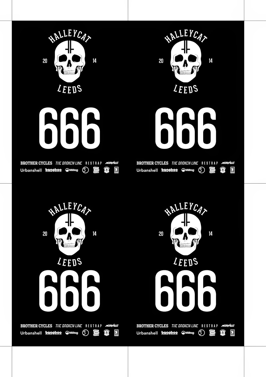
Something I have never designed before is spoke cards. These little cards are laminated and slotted in-between the spokes of a competitor's wheel. These cards have individual numbers and identify the rider to the event organisers. These cards are sometimes kept as a souvenir by the riders to show they took part in the event.


I was instructed to show the main logo, the north race logo on the other side in black on white and the sponsors as well as the number.


Fitting four on an A4 made this cost efficient and easily chopped down to be laminated.

The vinyl decals were made in both black and white to suit a variety of different frame colours. The example shown is gloss black on my matte black frame to match the other decals.


The spoke cards also fit perfectly to identify the bike.


The t-shirts themselves were discussed among ourselves over a few beers, there were all sorts of ideas flying around but in respect to cost and building the brand, we all decided to go the boring route and have the main logo screen printed white on a black t-shirt. This would be eye-catching, it'd look good and get sales and ultimately promote the event until the next year comes along.

I created the positive using standard A3 dimensions which would fit well over all sizes and I also created a mockup in case the guys wanted to promote the t-shirts before the event itself.


These came out really great and I looked forward to seeing how they sold at the event.


Comments for this entry

Leave your comment


Copyright 2010. All rights reserved.